Archives of Impermanence
Project: Identity, Art Direction, Brand Graphic Assets,
Spatial, Motion Graphics, Merchandise
Year: 2023

Archives of Impermanence (AoI) is a conceptual establishment that delves into the profound bittersweet realization of the temporary nature of life. AoI is both a storyteller and a place of reflection, exploration, and growth formed through a dynamic and growing curation of exhibits.
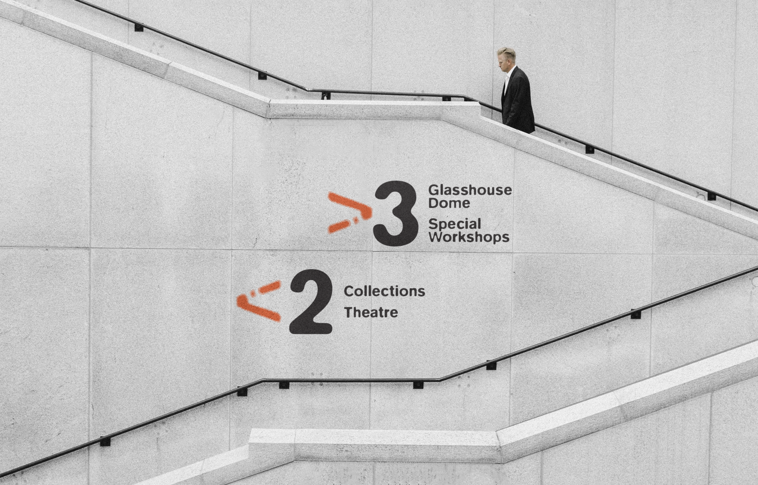
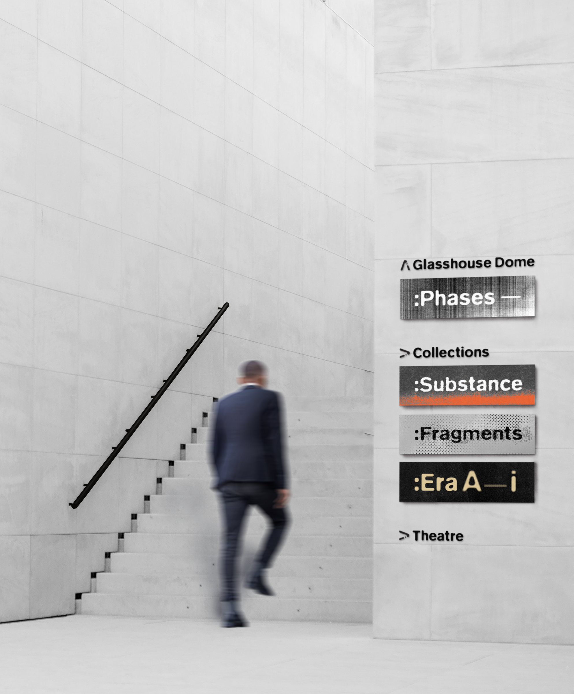
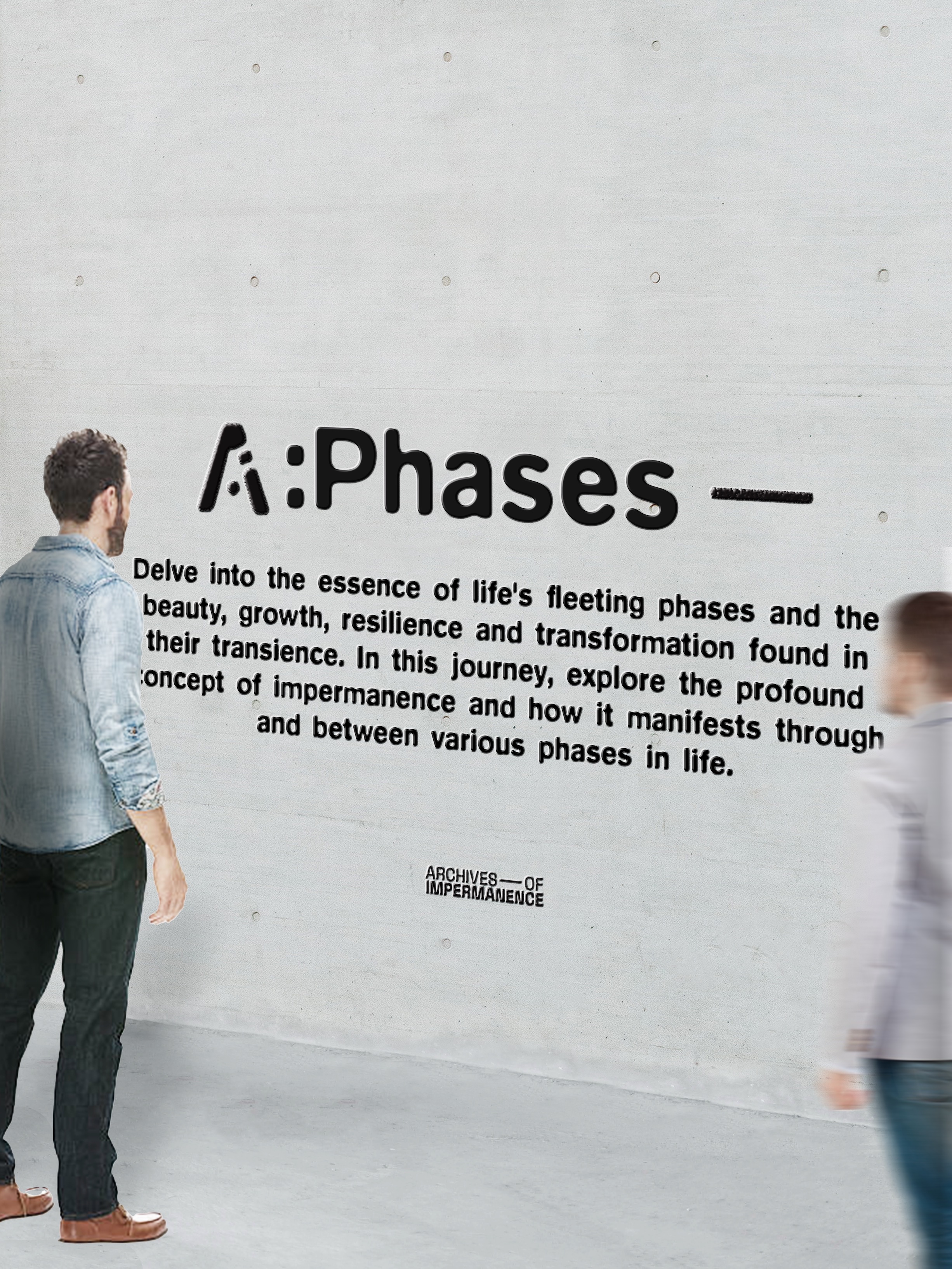
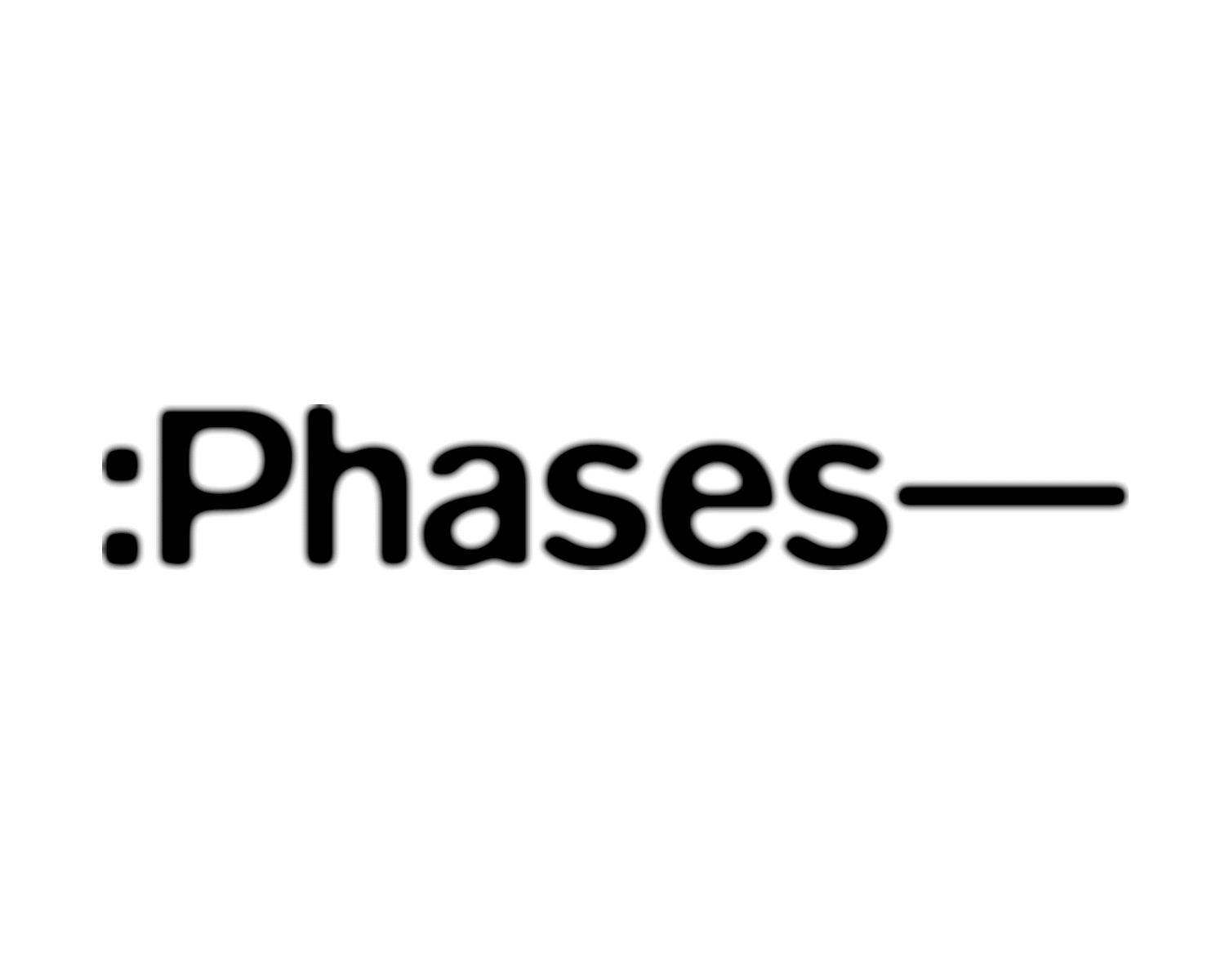
The area is organized into four primary zones, each dedicated to distinct topics (:Phases—, Era:A—I, Fragments, and Substance). Recorded journeys unfold through fragments of worn life objects and pieces exhibited in AoI.
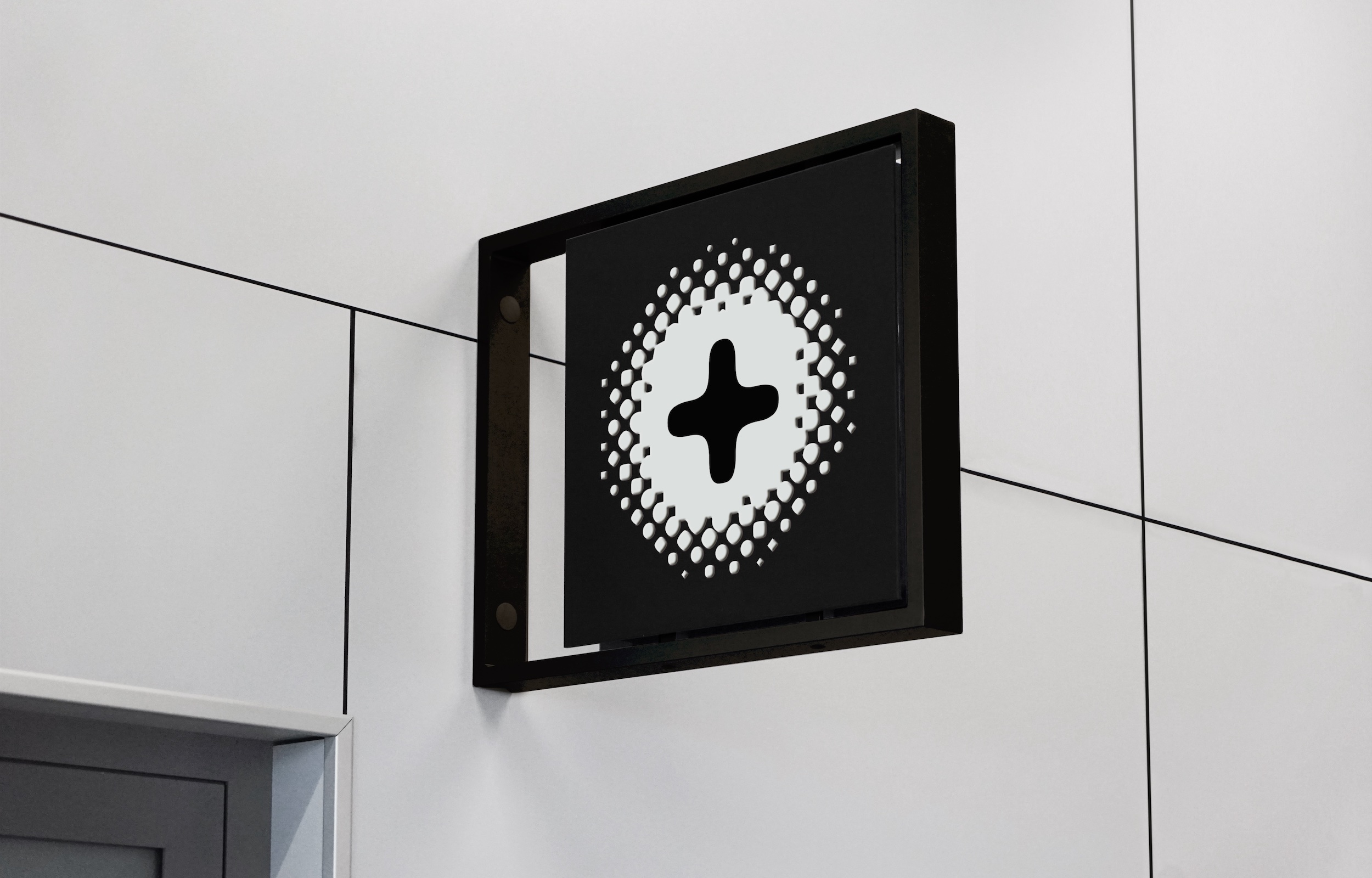
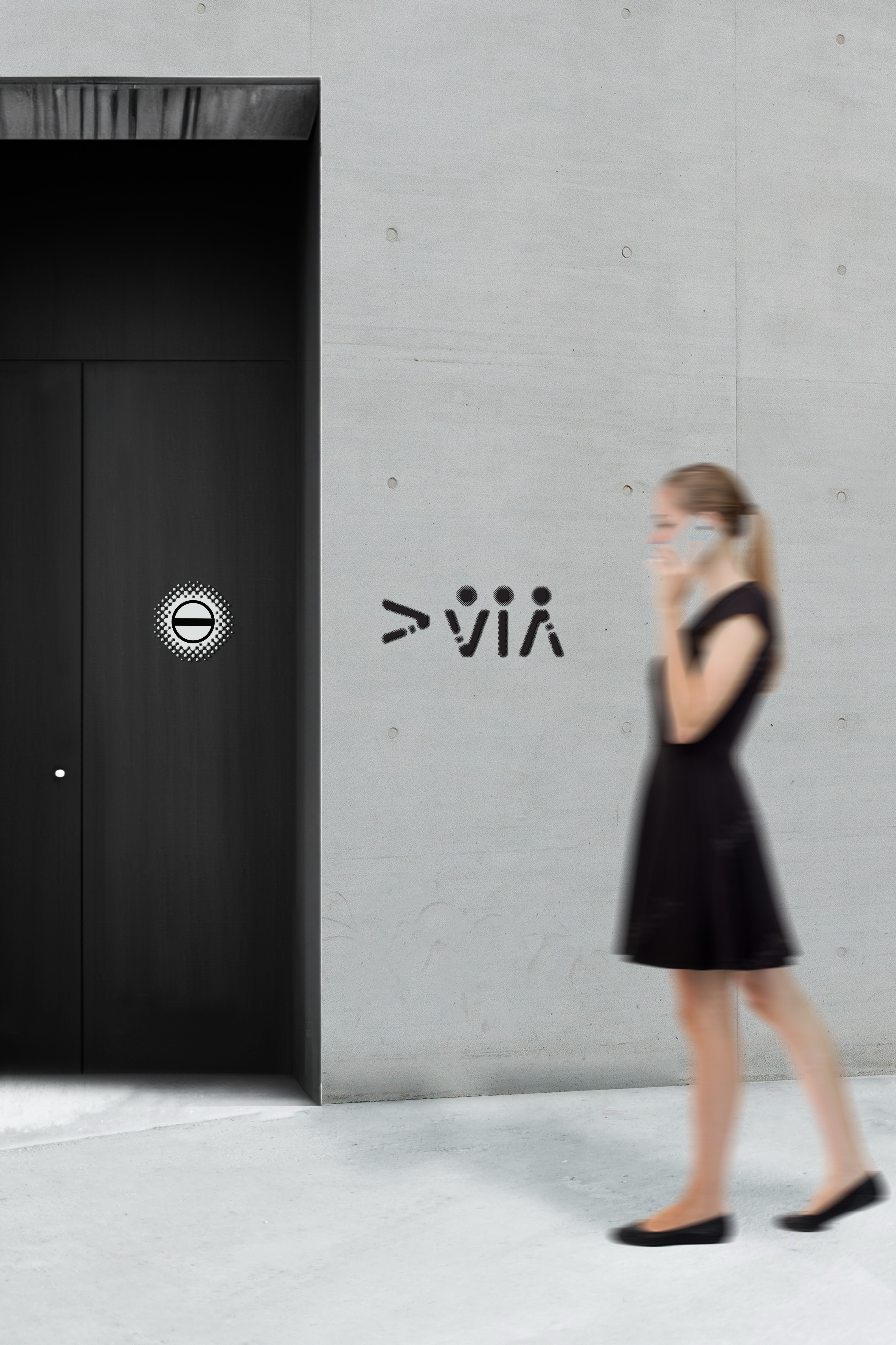
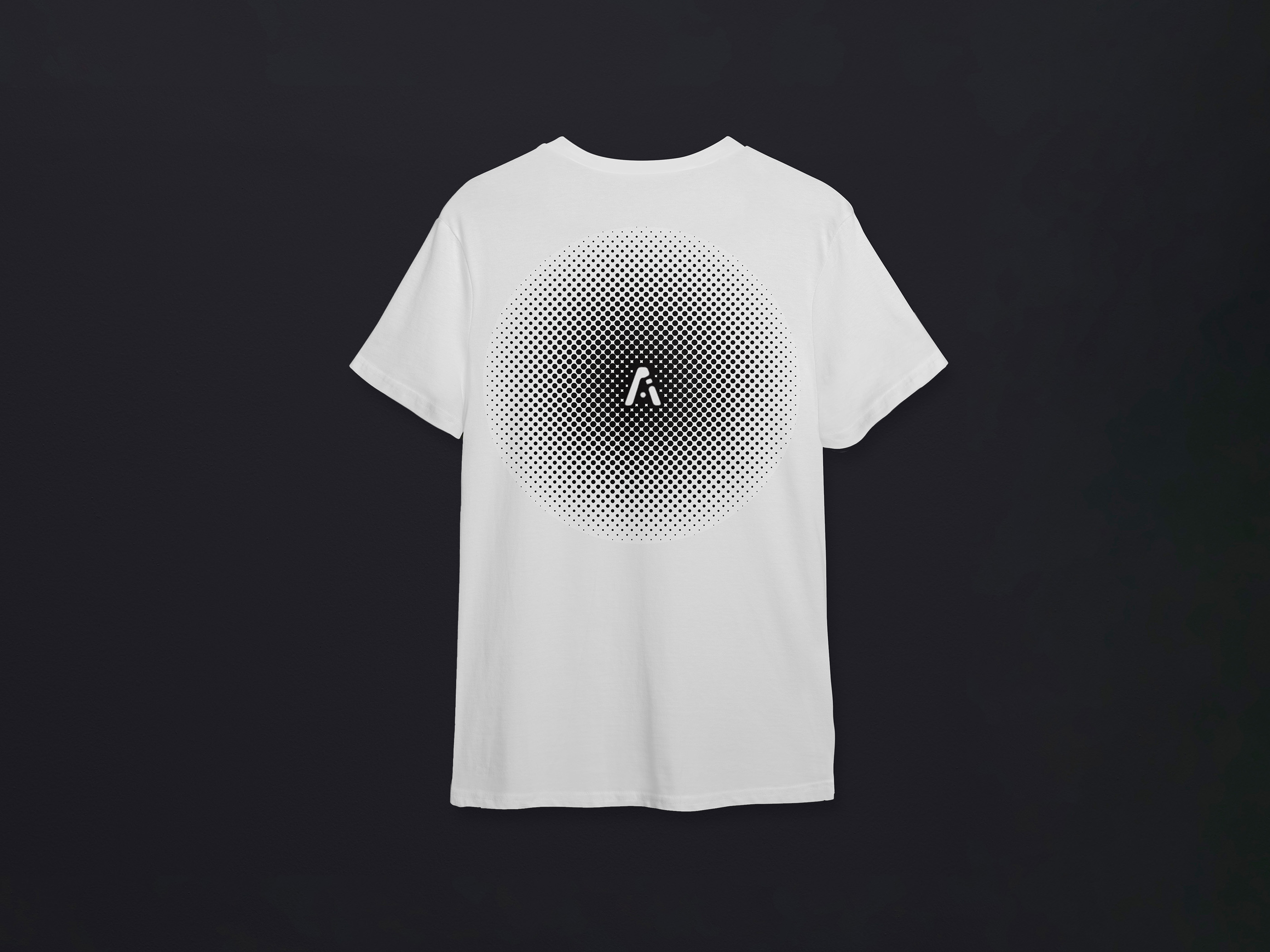
The brand is visualised through halftone graphics, which serve as a metaphor portraying the ebb and flow of progressions/movements as well as unpredictable changes associated with impermanence.
![]()
The area is organized into four primary zones, each dedicated to distinct topics (:Phases—, Era:A—I, Fragments, and Substance). Recorded journeys unfold through fragments of worn life objects and pieces exhibited in AoI.
The brand is visualised through halftone graphics, which serve as a metaphor portraying the ebb and flow of progressions/movements as well as unpredictable changes associated with impermanence.

The logomark is a deformed letter ‘A’, configuring the letters ‘AoI’—the acronyms of the brand. The dissappearing of the letter conceptualizes the brand’s topic of impermanence.
TYPOGRAPHY
01 ‘Blur’
Effectively conveys movement, impermanence, and resembles ink bleed throughits soft edges, fluidity, and visual metaphor for time.01A Movement
The typeface blurs the distinction between letters and spaces, conveying a feeling of fluidity and change.This aligns with the concept of impermanence, wherenothing remains static and everything is in a state of constant flux.
01B Organic Ink Spread
Blurred letters in a typeface can resemble the effect of ink bleeding on paper. This visual similarity to ink bleed is significant because it can evoke a sense of the organic and analogous imperfection.
02 ‘Courier’
A homage to the classic monospace typeface in old mediums. Each character occupies the same horizontal space, creating a consistent and unchanging structure, juxtaposed to the dynamic Blur typeface.
SEMIOTICS
01 Em dash (—)
A symbol adding a fluid temporal dimension to the brand language. Em Dash (—) can be a representation of a brief pause, continuation, and/or the transitions through the passage of time.
02 COLON (:)
A symbol indicating that what follows is a continuation, related to a particular time or temporal concept. It can be employed to show a time sequence, order, temporal lists, and/or time frames.

Intentionally, the brandmark and halftone graphic act as the leading pointers that tie in the environmental graphics and wayfinding. This decision leads to the creation of on-brand custom marks, including arrows and symbols.